
STUDIO LEI Company Information:
Livorno, Italy.
P.IVA / VAT: 07430260484
CASE
STUDIES
2025-2026
BODY BY B — PILATES / YOGA / WELLNESS


001
THE
BRIEF
BODY BY B needed a visual system that matched the studio’s real energy: powerful, precise, and genuinely welcoming. The goal was to translate the in-room experience — sharp coaching, warm community, high standards — into content that feels premium, consistent, and instantly recognisable, without slipping into fitness clichés.
002
THE
BUILD
-
Brand tone + content pillars (what BODY BY B repeats — and refuses)
-
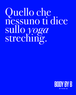
Social visual system (templates, type rules, spacing, rhythm)
-
Industry insights (educational posts + coaching cues)
-
Curated demand toolkit (built for a limited room)
003
THE
SHIFT
BODY BY B started showing up online the way it feels in person: high-energy, high-standard, and welcoming. The content became recognisable at a glance — not just “pretty”, but clear enough to convert. With a repeatable system in place, the studio could stay consistent without losing personality.
 |  |
|---|---|
 |  |
 |  |
 |  |
 |
BIODOLA SEA CLUB —ELBA ISLAND SEA CLUB


001
THE
BRIEF
BIODOLA SEA CLUB needed a first impression that felt like arrival: sun-warmed ease, salt air, and quiet premium — without slipping into generic “beach club” visuals. The goal: create a 9-post grid that established atmosphere, rhythm, and a recognisable world from day one.
002
THE
BUILD
-
Grid creative direction (tone, references, visual rules)
-
Colour + texture cues (sea-light palette, natural materials, negative space)
-
Post-by-post pacing (so the grid reads as a story, not a collage)
-
Content pillars for continuity (so future posts stay coherent as the season moves)
003
THE
SHIFT
The Instagram stopped reading as “new account content” and started reading as a place. In nine posts, BIODOLA SEA CLUB became a visual destination — the kind people save, send, and return to — because the world felt consistent, not just pretty.
LEVI MARCUS—CARIBBEAN FASHION BRAND "ALOUBAÉRA" SUMMER.


001
THE
BRIEF
LEVI MARCUS needed a campaign world that could hold Caribbean roots and contemporary fashion at the same time — not as a costume, but as a lived frequency. The goal: create a visual language that felt collectible, editorial, and unmistakably theirs.
002
THE
BUILD
-
Creative direction for the collection world (tone, references, visual rules)
-
Colour + emotion mapping (protecting signature pink while expanding the palette with intention)
-
Campaign story structure (so each image felt like part of a larger memory)
-
Content ecosystem cues (how the world repeats across posts, product moments, and drops)
003
THE
SHIFT
The collection stopped reading as “a drop” and started reading as a place. ALOUBAÉRA became a visual memory — the kind people return to, screenshot, and share — because the world was coherent, not just beautiful.
AKIYAMA
MARTIAL ARTS GYM — LIVORNO


001
THE
BRIEF
AKIYAMA had the substance — discipline, ethics, community — but the brand wasn’t translating that feeling fast enough online. The gym needed new energy through the door without losing what made it real.
002
THE
BUILD
-
Positioning + message clarity (what AKIYAMA stands for, in plain language)
-
Visual identity direction (a look that feels strong, grounded, and human)
-
Social media system (templates + rhythm + content cues) designed to convert attention into visits
003
THE
SHIFT


